Multi-Use Flight Information Display
Creative Direction | Strategy | Design
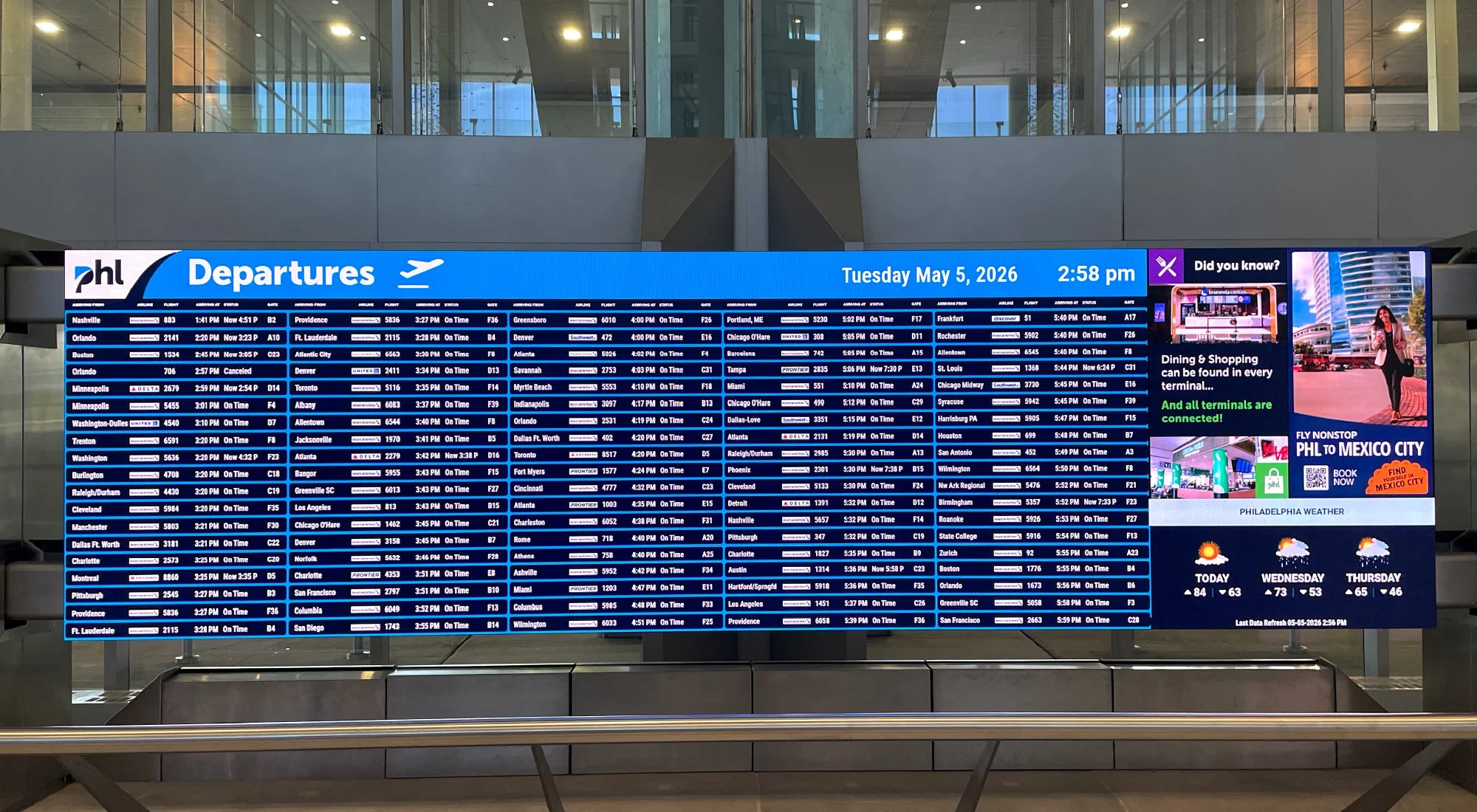
The Philadelphia International Airport was implementing a new CMS platform to manage the digital screens throughout the entire airport, as well as, installing new dynamic screens. This project required a strategic approach to updating existing content to the new PHL brand identity, thoughtful placement of content throughout the airport, and custom sizing compatible with the new screens and CMS platform.
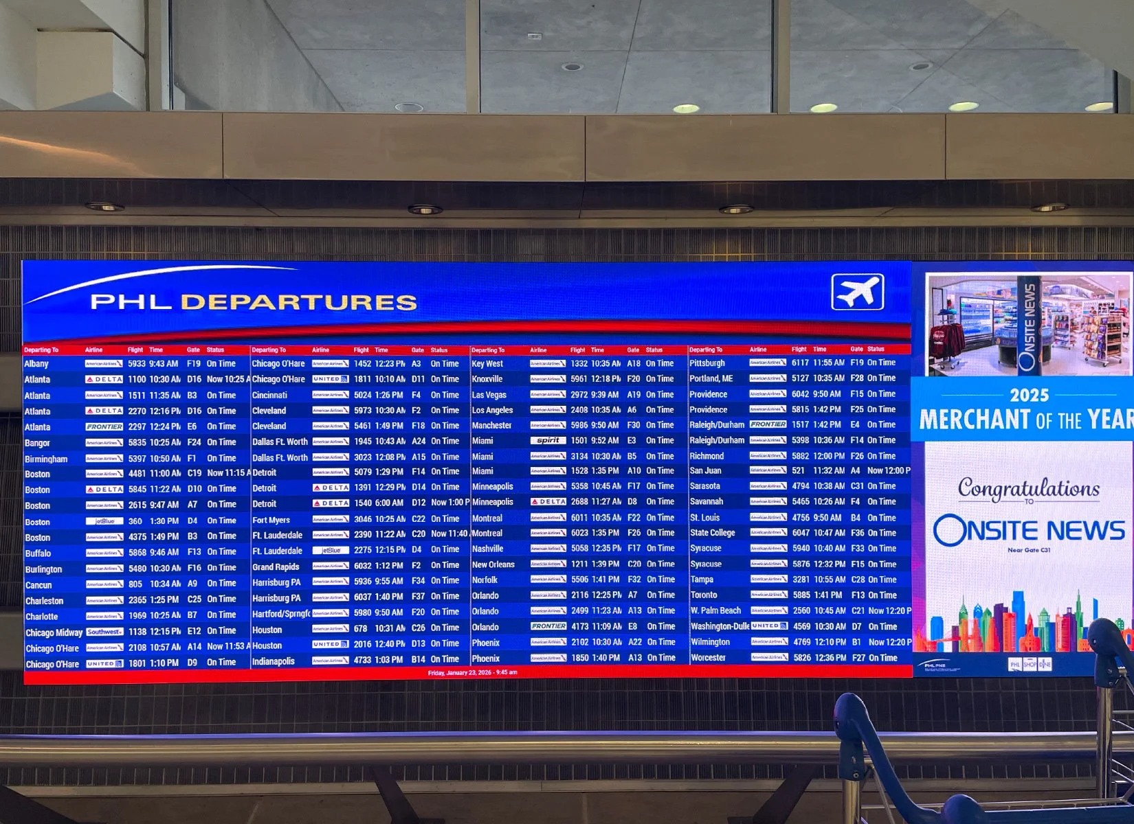
Before: Logo and "Departures" are stretched within the space, text is small and difficult to read, content utilizes old branding, and the color red is drawing too much attention away from the important, passenger information.
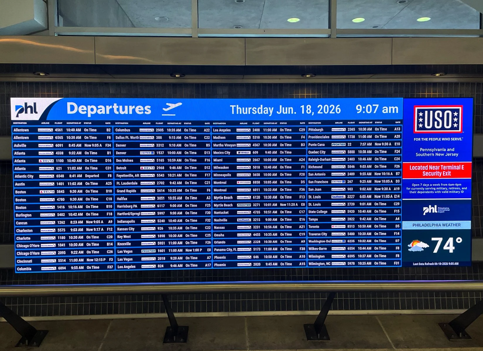
After: The new logo, "Departures," and the date and time are clearly visible at the top of the content. A brand icon is brought in to reinforce that this is a departure screen. Columns are more clearly defined and text size and weight has been slightly increased for easier readability.
The Goal: Create passenger facing content that is easier to read, clearer to understand, and reflects the updated brand identity.
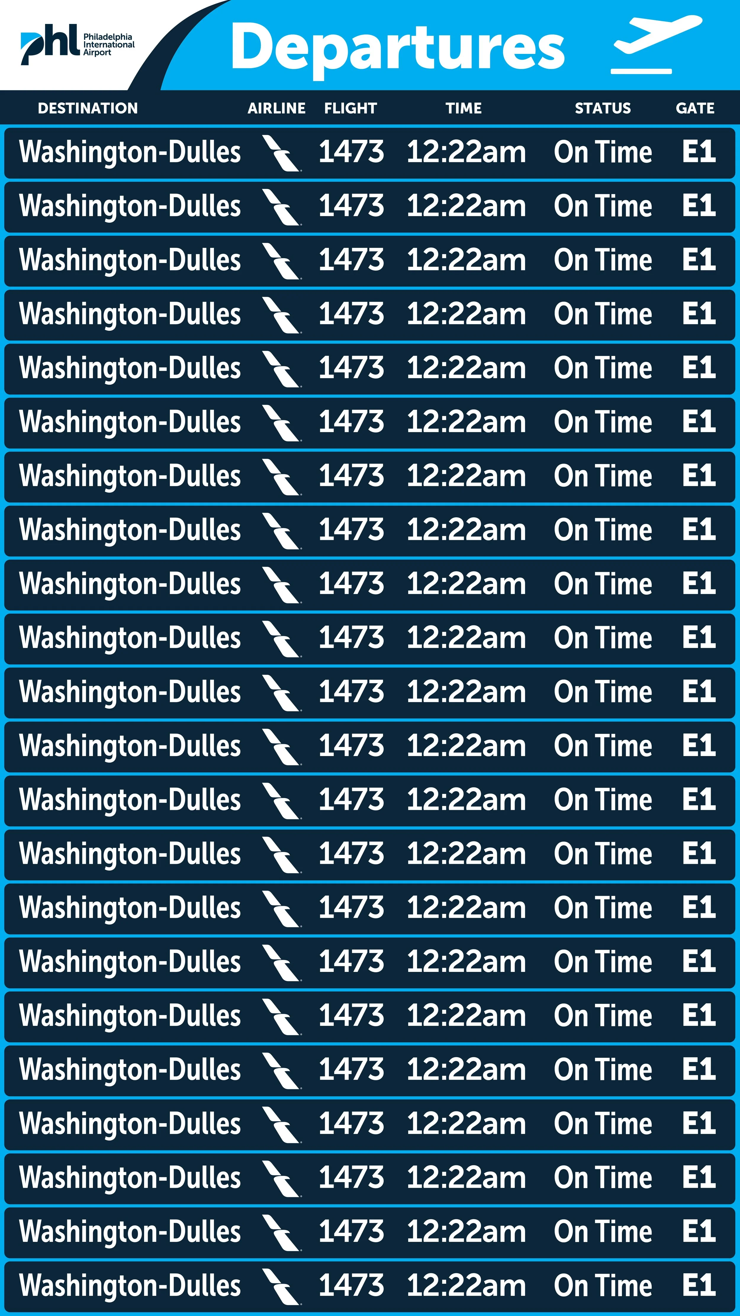

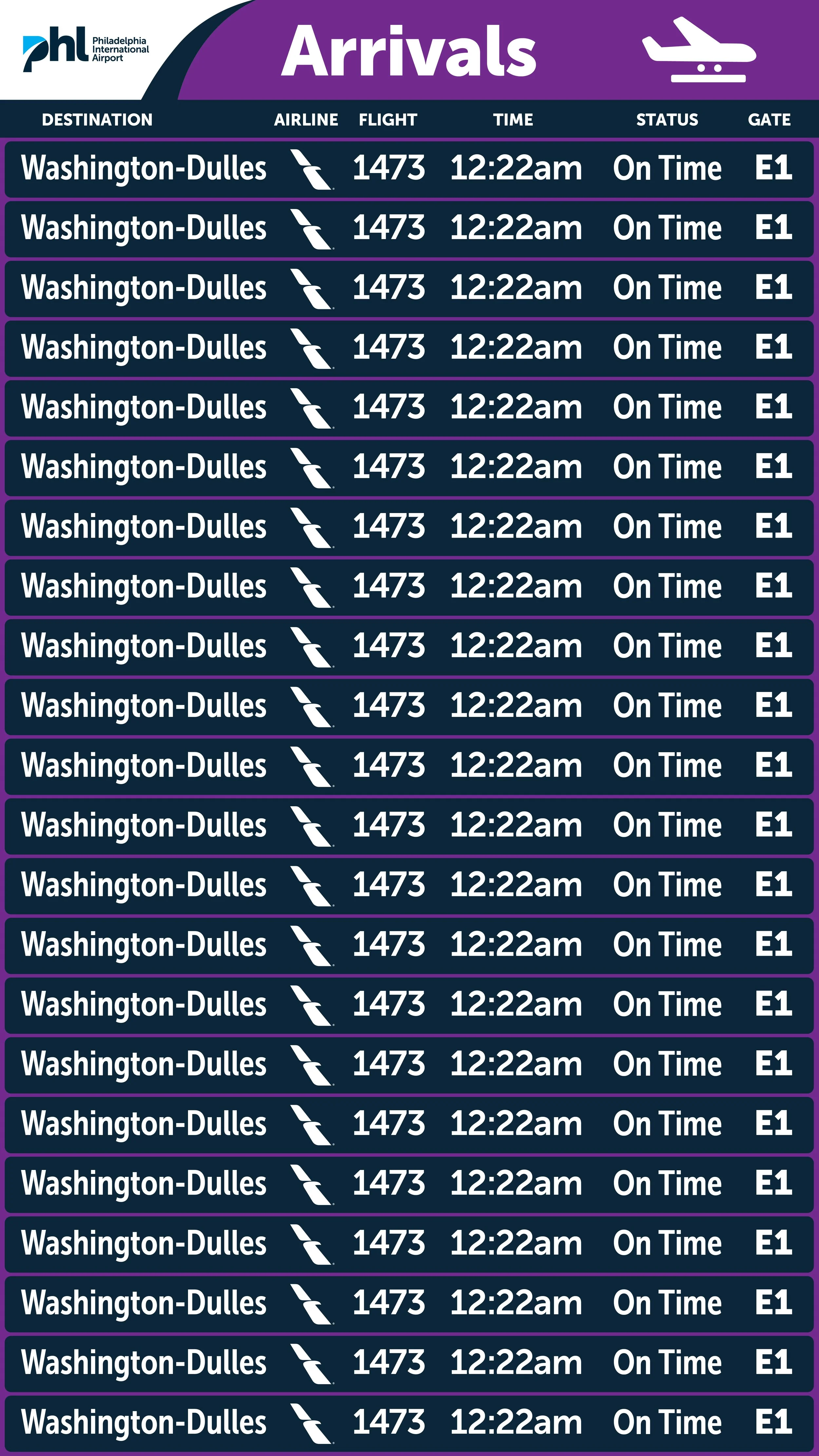
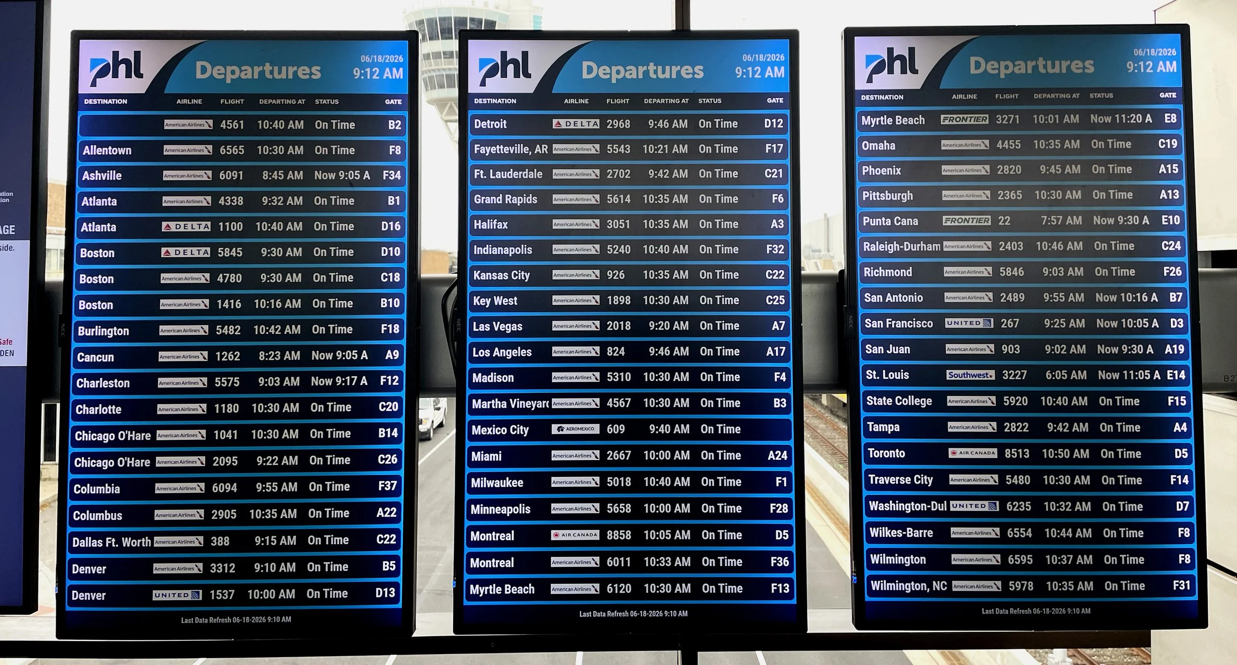
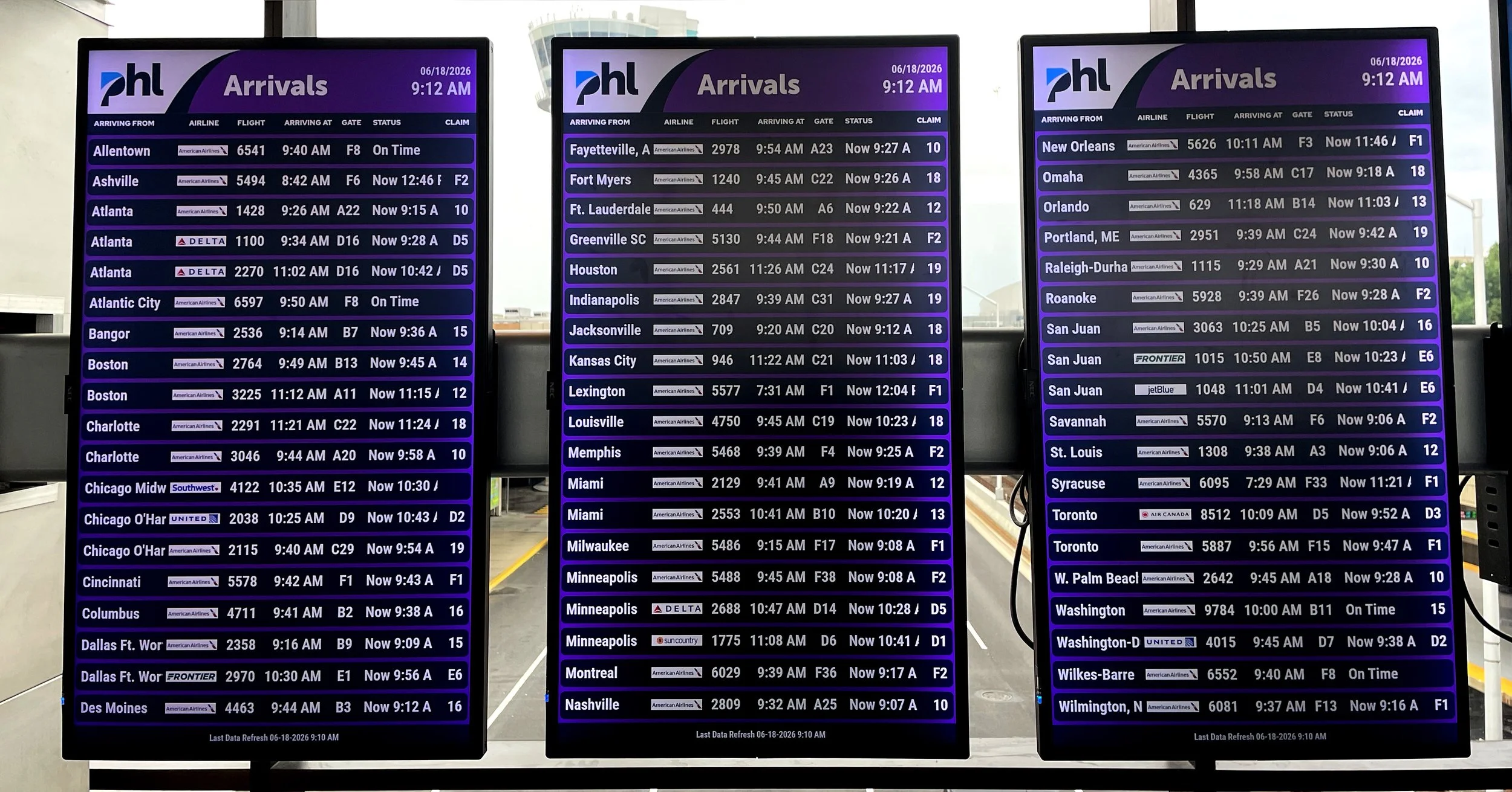


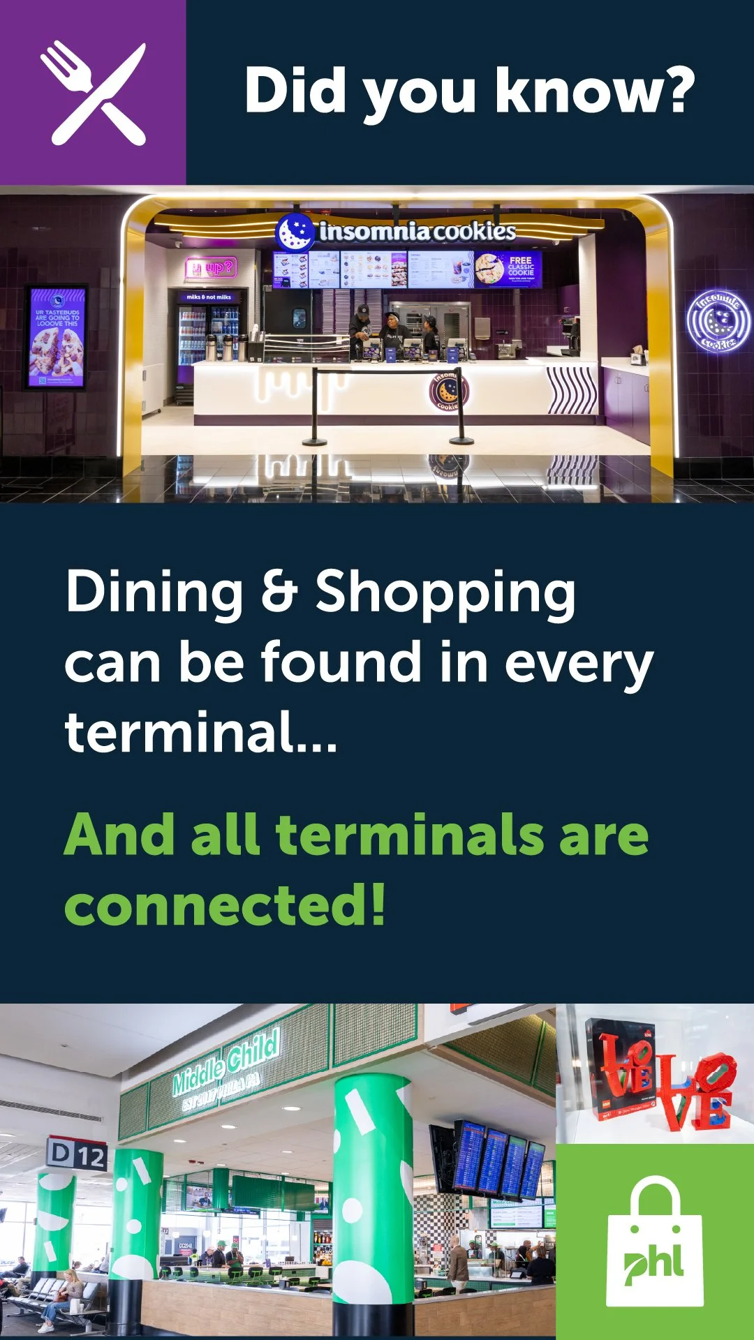
In addition to updating the flight information display system, the new CMS platform had the capability to build content playlists and display specific playlists in designated areas of the airport. I developed a strategy that introduced content in buckets and recommended areas of the terminal to display the content. The strategy served as a guide for the IT team on how to build the backend of the CMS platform, and as a reference point for the creative team when designing content. It was also a great communication tool when discussing displayed content with cross-functional partners.